Ray-Ban Official Website
My work on the official Ray-Ban e-commerce website included two major projects: Virtual Try-On and the introduction of prescription sunglasses and medical insurance allowing the price reduction or reimbursement. I also worked on improving existing sections of the website to enhance usability and update them as part of the development of the brand's visual identity.

Virtual try-on
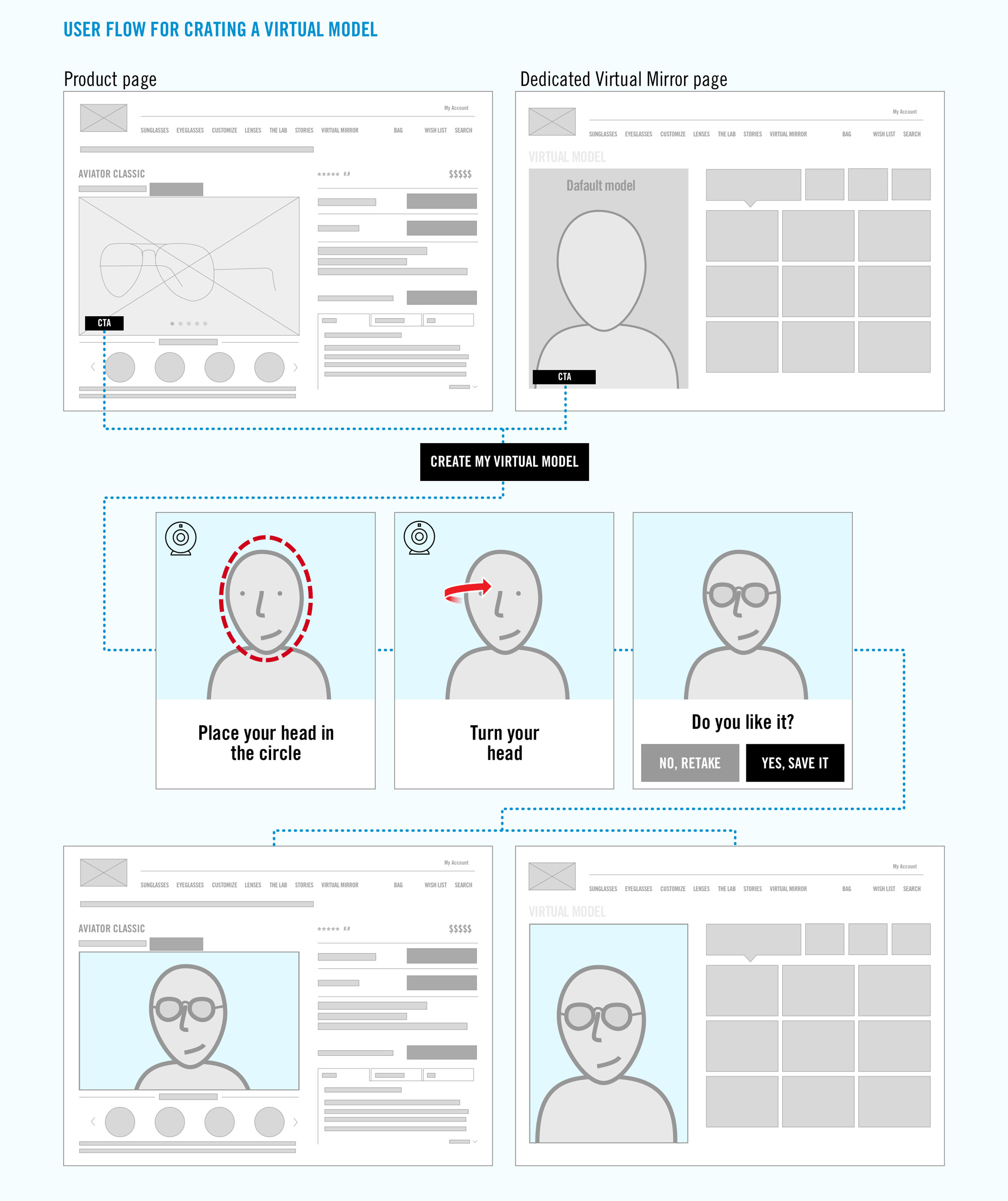
A brand new functionality allowing the user to take a video of themselves and preview glasses on their face.
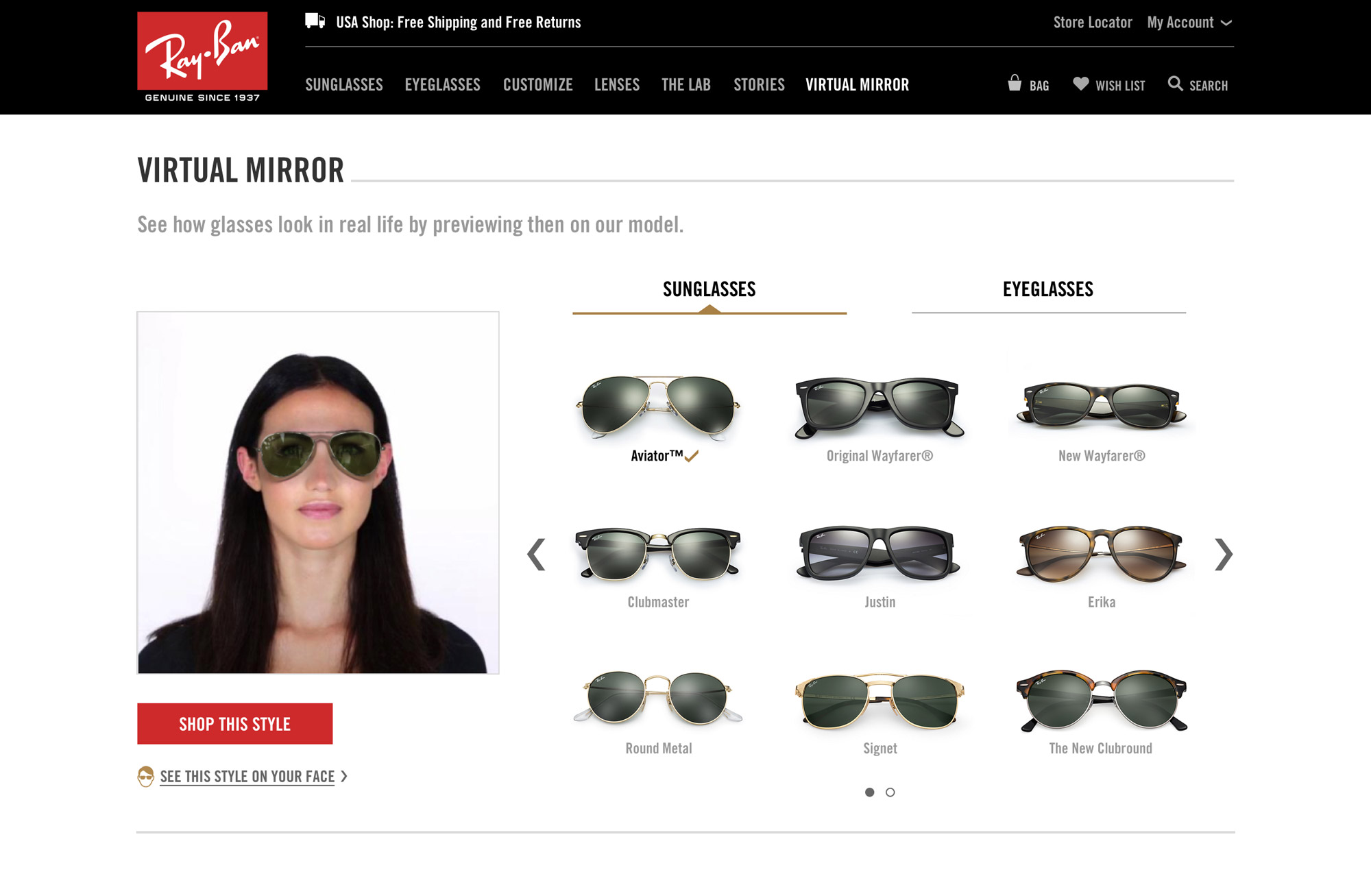
Virtual Mirror hub allowing the user to preview different models of glasses on their face and buy the pair they like or preview the functionality before they create their own Virtual Model.
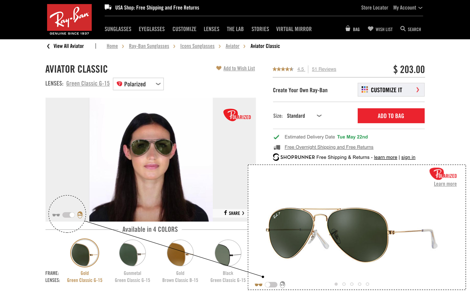
Product page displays the glasses directly on the user’s virtual model, making it easier to pick the most suitable pair of glasses, with the option to switch to the standard product view.
Introducing prescription lenses for sunglasses and insurance reimbursement

Golden colour was selected as a feature colour and used in all calls to action and user interface elements associated with the prescription glasses for a better recognition and accessibility.


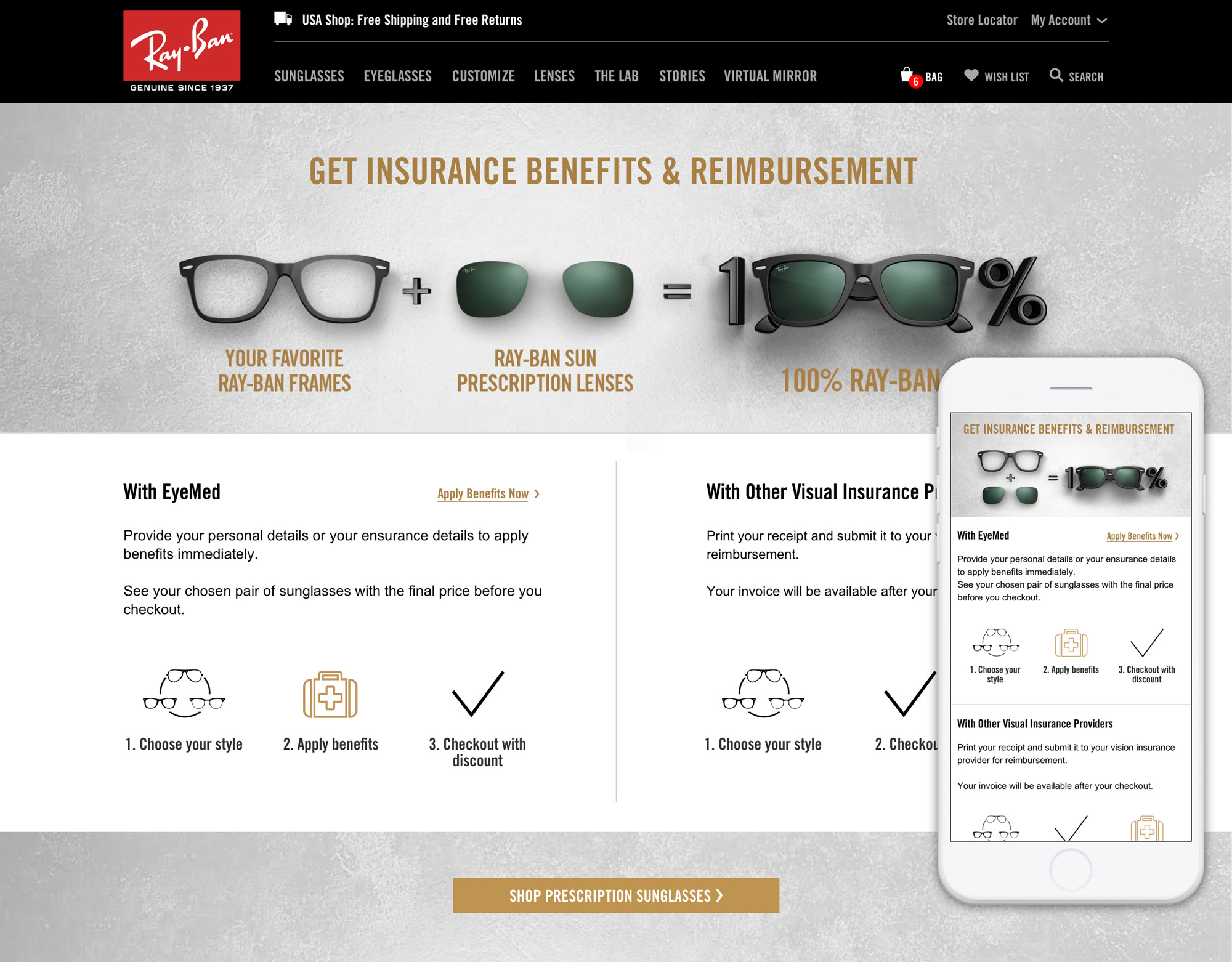
Static page informing the user about how reimbursement works according to their insurance plan.
Registration form for filling in insurance details and applying the discount.

Updating existing elements of the website to improve usability
Making changes to the menus to improve usability, enhance navigation, product discoverability and recognition.
Before:
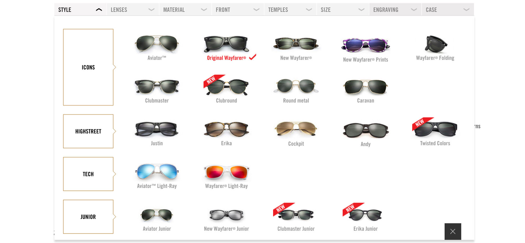
After:


