Ray-Ban Redesign
A light and minimal editorial-style design featuring a clear hierarchy, easy navigation and an improved discoverability of the large range of products.

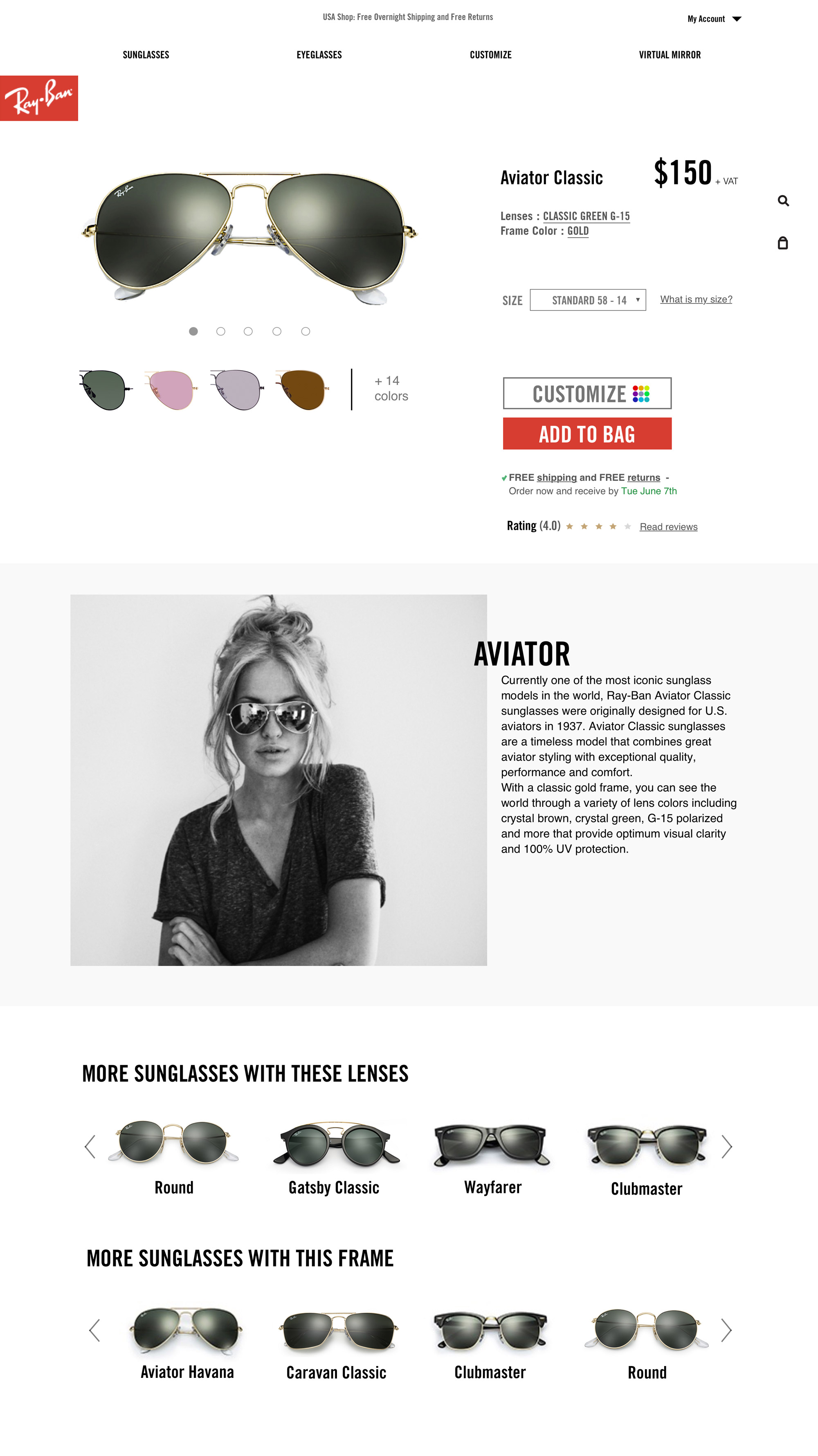
The asymmetric layout follows a strict hierarchy, with font sizes and styling clearly indicating sections and subsections, allowing the site to both look unique and dynamic, and have an easy navigation.

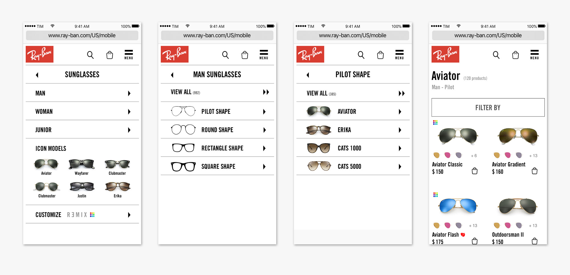
Menu allowing easy access to different sections of the website.

To make the navigation and discoverability of the large range of Ray-Ban products easier, there are categories and filters always visible on the category listing page on desktop.

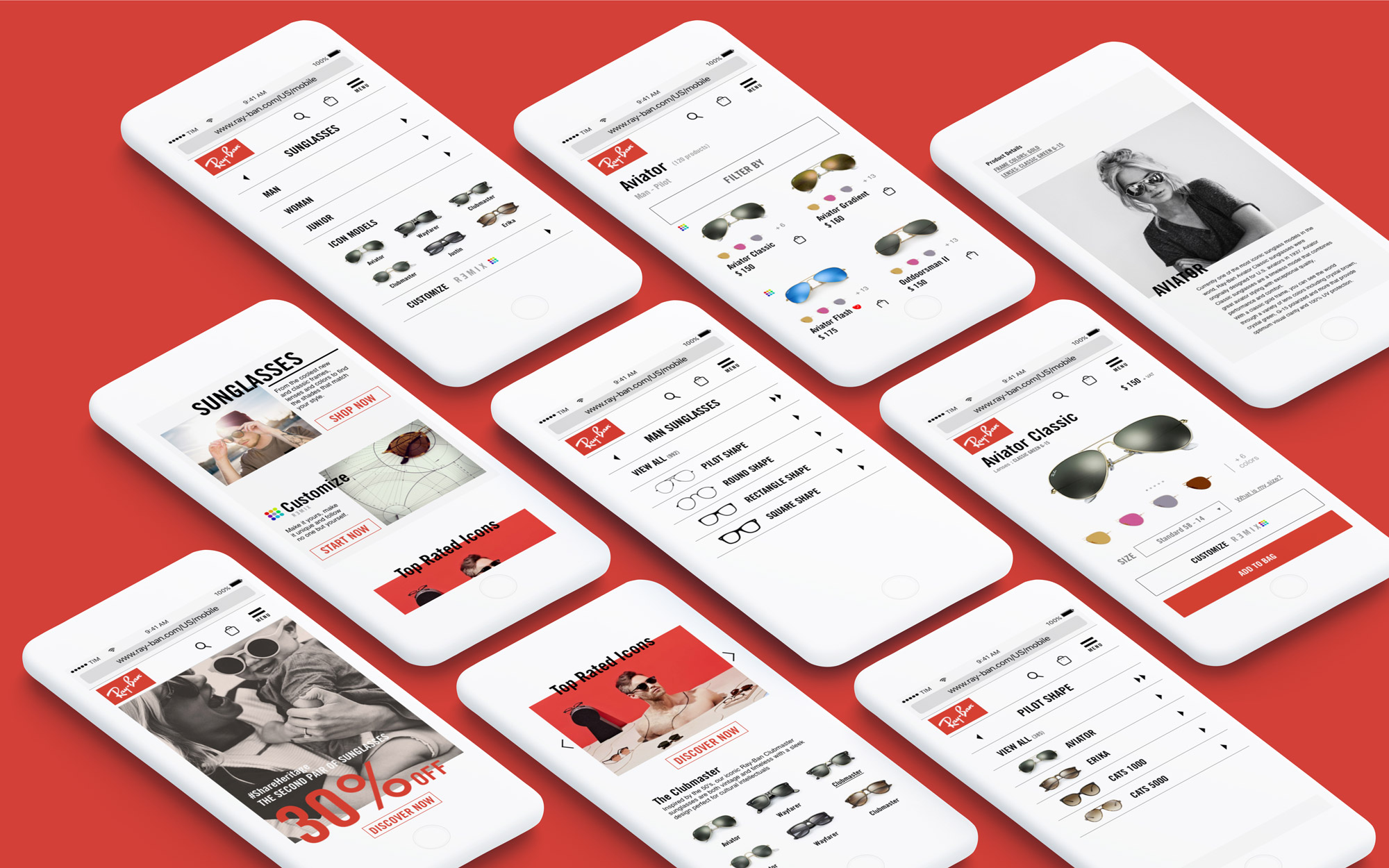
On mobile, for the lack of screen space and inability to display the complex system of categories and filters all at once, the user journey is more linear and offers steps instead. This allows the user to gradually narrow down their search and find and discover products without being overwhelmed by the large selection.
Product page following the asymmetric layout and editorial style of the home page.