ATM
A website/web application designed to simplify and streamline the process of getting an appropriate ticket for the Milan metro. Separated into several zones with different ticket prices, the metropolitan system can be hard to navigate even for the natives. The proposed design simplifies the task by separating the process into a few easy and predictable stages and selecting the ticket automatically based on the user’s starting point and destination.

The research began by observing how people purchase in one of the biggest stations of the Milan metro, interviewing a few of them and creating personas. Personas help to visualise the users, sympathise with them and their needs and understand their mental model and expectations. All of it helps the development of a product that is highly usable and intuitive.

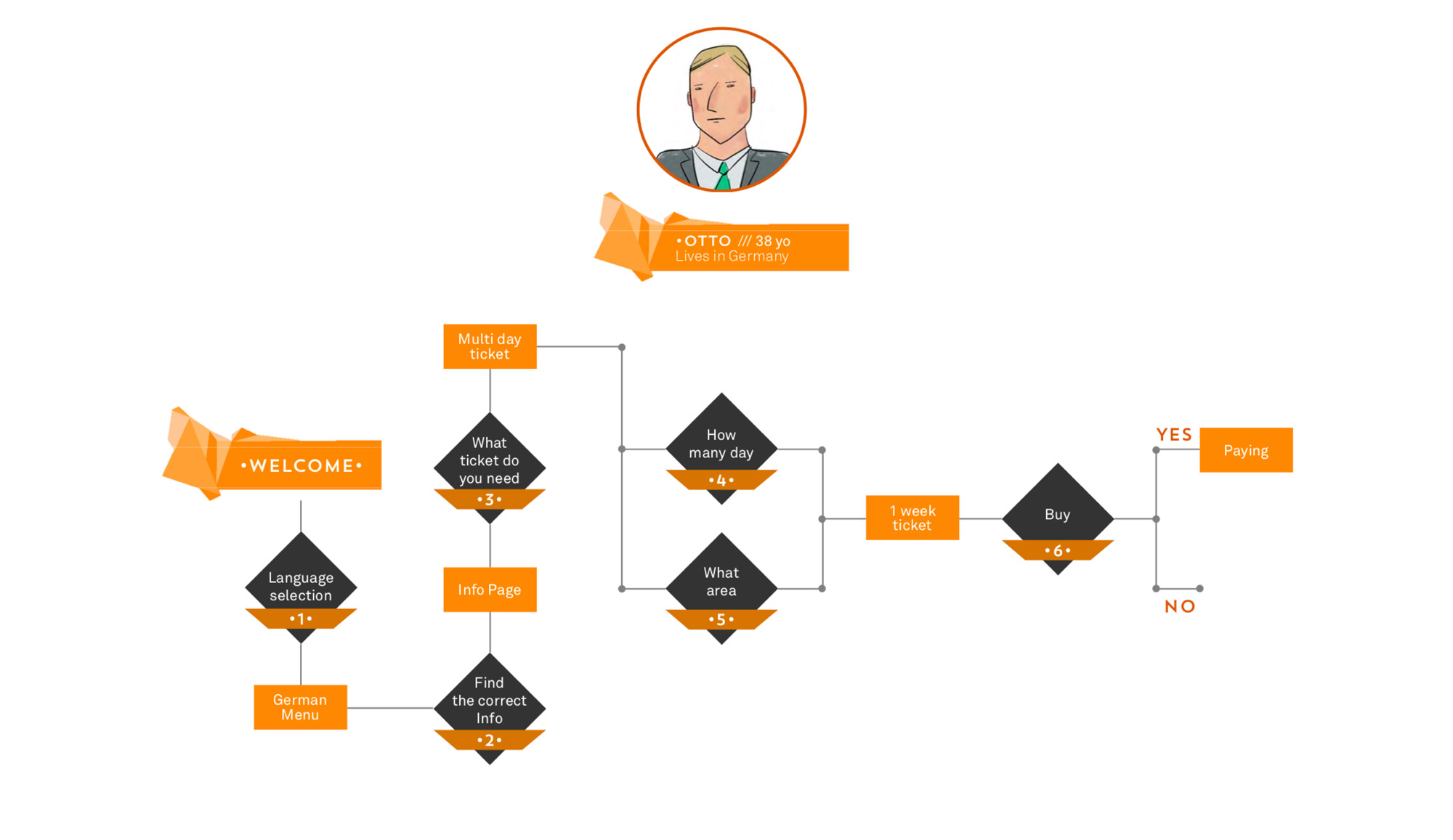
A task flow was created for every persona to visualise steps of their interaction process with the system and inform the future design.

As the first step a low-fidelity clickable prototype was created in Balsamiq for user testing. It was iterated and improved according to the testing results, then wireframes were created for all web-application screens. After the wireframes were reviewed and approved, the final design was applied.

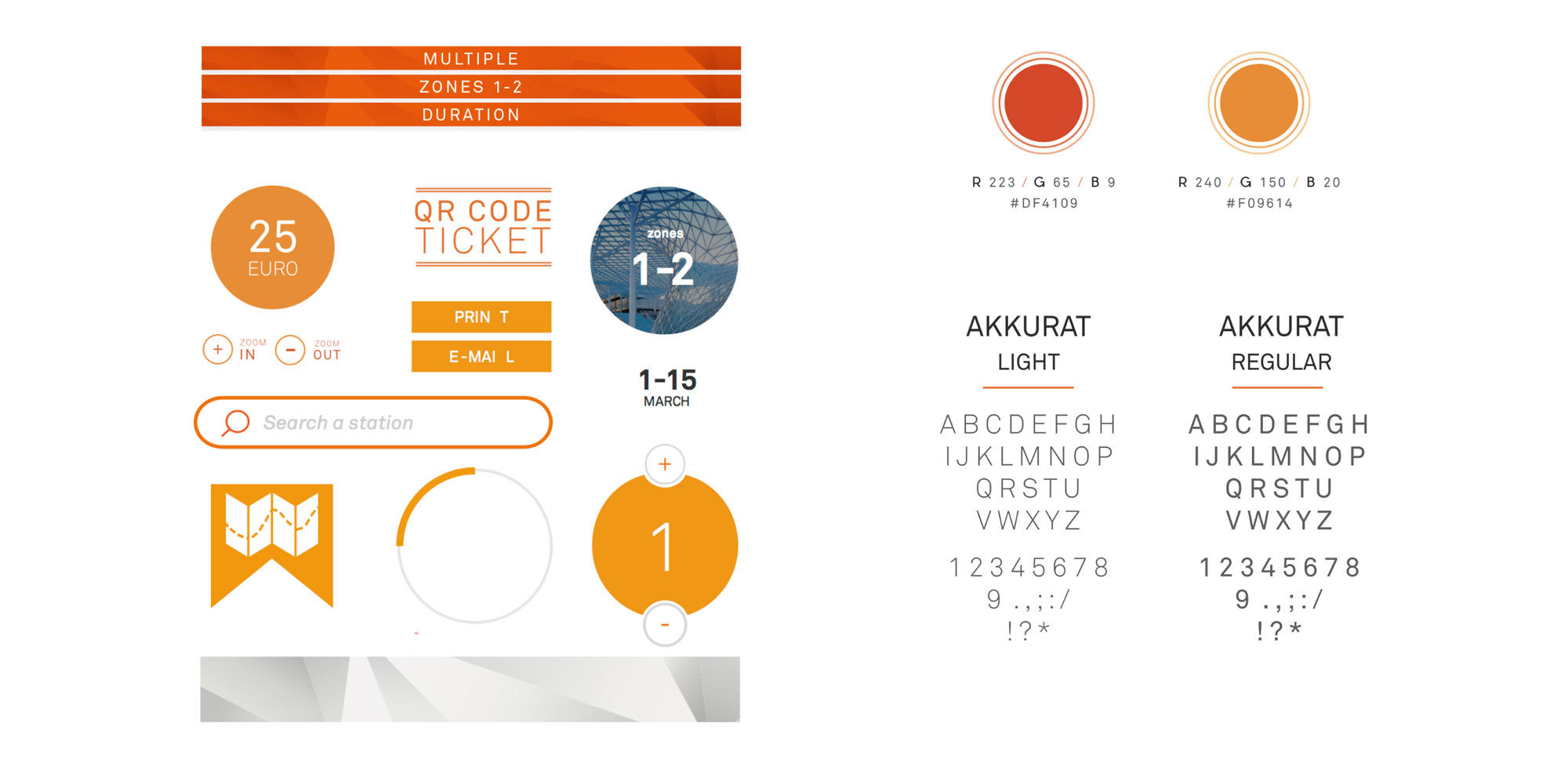
Styleguide featuring user interface elements, textures, colours and typefaces. Different shades of orange were chosen for all interactive elements for easier recognition and consistency throughout the application.

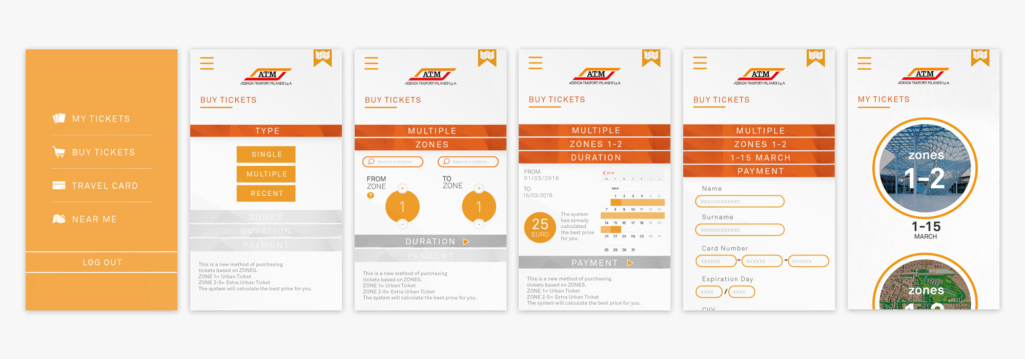
Flow showing the purchase of a multiple trip ticket from the main menu to the final step.

